# 【组件】 列表模板组件 I
# 描述
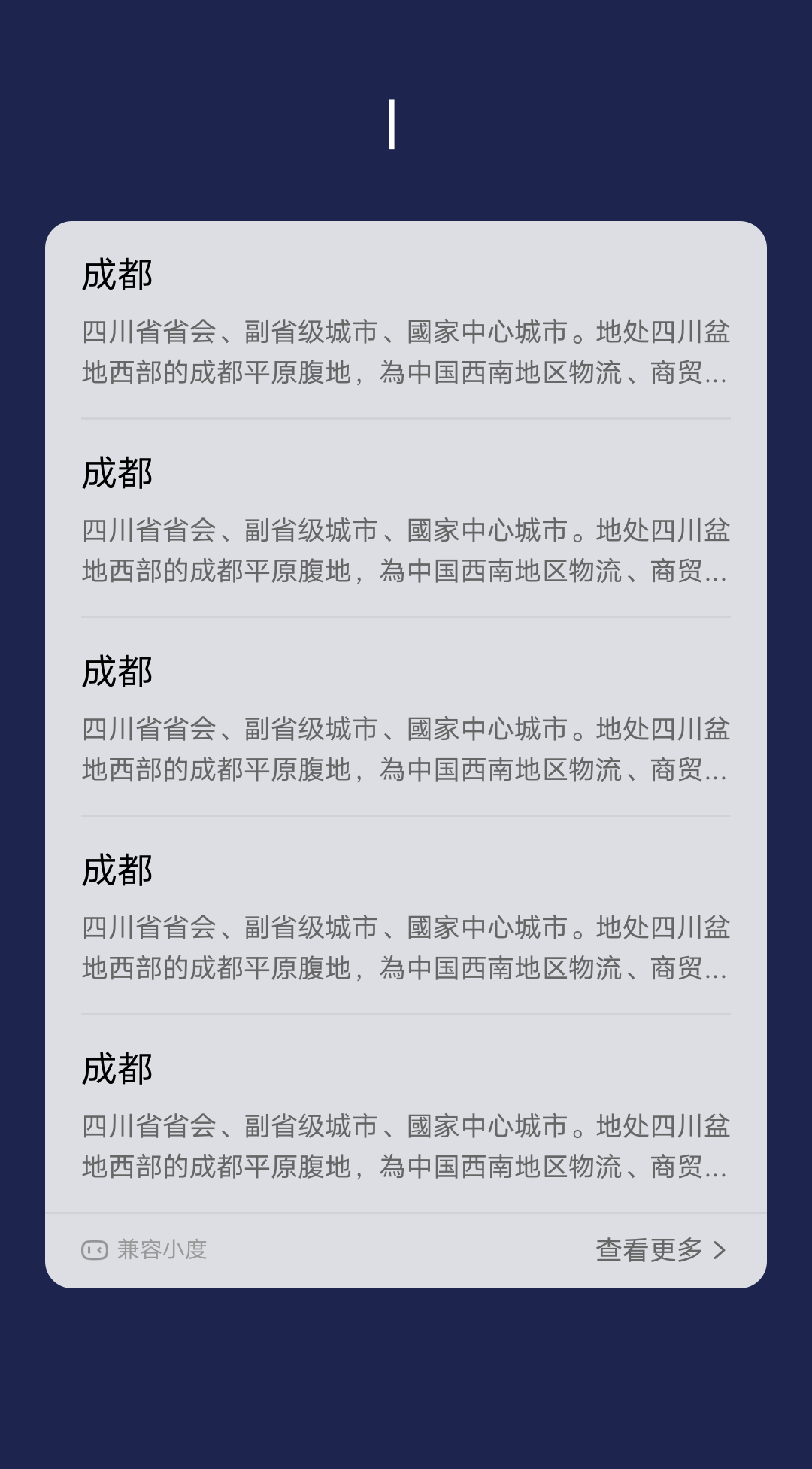
标题 + 描述文字
# 使用效果
# 使用方法
在.ux文件中引入组件
<import
  name="list-item-i"
  src="vivo-cards-suits/components/voice/components/list-item-i.ux"
></import>
1
2
3
4
2
3
4
# 示例
<template>
  <div class="card">
    <div class="list">
      <div
        class="list-item-wrap {{$idx!==0?'border-top':''}}"
        for="{{listData.slice(0,6)}}"
      >
        <list-item-i
          title="{{$item.title}}"
          content="{{$item.content}}"
        ></list-item-i>
      </div>
    </div>
  </div>
</template>

<script>
  import router from "@system.router";

  export default {
    data() {
      return {
        listData: [
          {
            title: "标题",
            content:
              "只需要输入文字,列表高度将自动匹配。只需要输入文字,列表高度将自动匹配。"
          },
          {
            title: "标题",
            content:
              "只需要输入文字,列表高度将自动匹配。只需要输入文字,列表高度将自动匹配。"
          },
          {
            title: "标题",
            content:
              "只需要输入文字,列表高度将自动匹配。只需要输入文字,列表高度将自动匹配。"
          },
          {
            title: "标题",
            content:
              "只需要输入文字,列表高度将自动匹配。只需要输入文字,列表高度将自动匹配。"
          },
          {
            title: "标题",
            content:
              "只需要输入文字,列表高度将自动匹配。只需要输入文字,列表高度将自动匹配。"
          },
          {
            title: "标题",
            content:
              "只需要输入文字,列表高度将自动匹配。只需要输入文字,列表高度将自动匹配。"
          }
        ]
      };
    }
  };
</script>

<style lang="less">
  .border-top {
    border-top: 2px solid rgba(0, 0, 0, 0.05);
  }

  .card {
    width: 100%;
    flex-direction: column;
    .list {
      flex-direction: column;
      padding: 0 32px;
    }
  }
</style>
1
2
3
4
5
6
7
8
9
10
11
12
13
14
15
16
17
18
19
20
21
22
23
24
25
26
27
28
29
30
31
32
33
34
35
36
37
38
39
40
41
42
43
44
45
46
47
48
49
50
51
52
53
54
55
56
57
58
59
60
61
62
63
64
65
66
67
68
69
70
71
72
73
2
3
4
5
6
7
8
9
10
11
12
13
14
15
16
17
18
19
20
21
22
23
24
25
26
27
28
29
30
31
32
33
34
35
36
37
38
39
40
41
42
43
44
45
46
47
48
49
50
51
52
53
54
55
56
57
58
59
60
61
62
63
64
65
66
67
68
69
70
71
72
73
# API
# 组件属性
| 属性 | 类型 | 默认值 | 说明 |
|---|---|---|---|
| title | String | - | 标题 |
| content | String | - | 描述文字 |