# 【组件】 卡片模板组件 G
# 描述
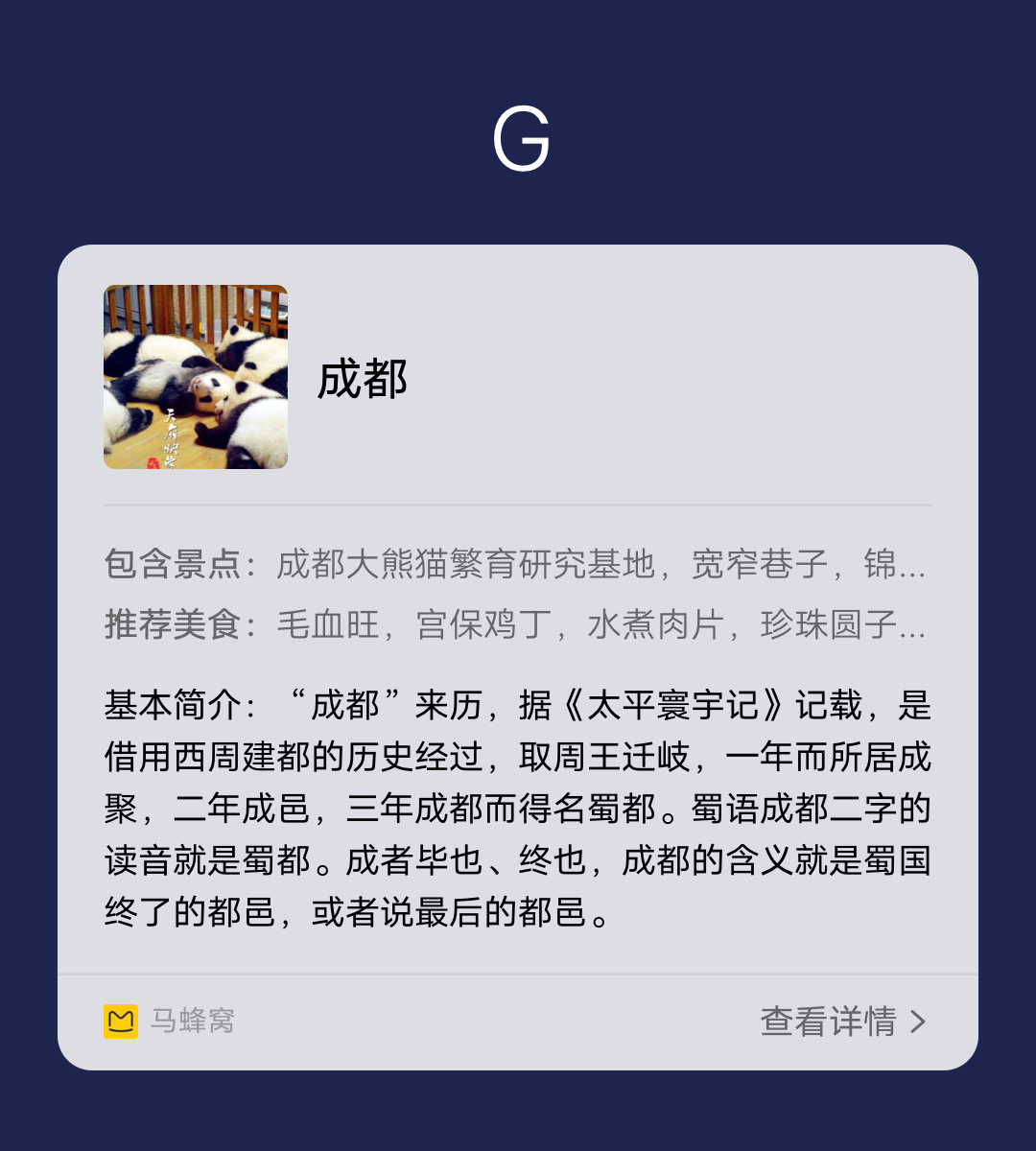
左图 + 标题 + 正文 + 参数
# 使用效果
# 使用方法
在.ux文件中引入组件
<import
  name="template-g"
  src="vivo-cards-suits/components/voice/components/template-g.ux"
></import>
1
2
3
4
2
3
4
# 示例
<template>
  <div class="card">
    <template-g
      title="{{title}}"
      content="{{content}}"
      params="{{params}}"
      img-type="{{imgType}}"
      img-url="{{imgUrl}}"
      img-resize-mode="{{imgResizeMode}}"
      img-object-fit="{{imgObjectFit}}"
    ></template-g>
  </div>
</template>

<script>
  export default {
    data() {
      return {
        title: "标题",
        content:
          "正文内容,卡片内容无限折行,不超过最大卡片高度,内容行数2行以上。",
        params: [
          {
            key: "参数参数",
            value: "参数信息参数信息参数信息参数信息参数信息"
          },
          {
            key: "参数数",
            value: "参数信息参数信息参数信息参数信息参数信息"
          },
          { key: "参数", value: "参数信息参数信息参数信息参数信息参数信息" }
        ],
        imgType: "B", // A: 144*108 B: 128*128
        imgUrl: "",
        imgResizeMode: "cover",
        imgObjectFit: "cover"
      };
    }
  };
</script>

<style lang="less">
  .card {
    width: 100%;
    flex-direction: column;
  }
</style>
1
2
3
4
5
6
7
8
9
10
11
12
13
14
15
16
17
18
19
20
21
22
23
24
25
26
27
28
29
30
31
32
33
34
35
36
37
38
39
40
41
42
43
44
45
46
47
2
3
4
5
6
7
8
9
10
11
12
13
14
15
16
17
18
19
20
21
22
23
24
25
26
27
28
29
30
31
32
33
34
35
36
37
38
39
40
41
42
43
44
45
46
47
# API
# 组件属性
| 属性 | 类型 | 默认值 | 说明 |
|---|---|---|---|
| title | String | - | 标题 |
| content | String | - | 正文内容 |
| params | Array | - | 参数数据 |
| imgType | String | B | 图片的尺寸类型,A: 144*108 B: 128*128 |
| imgUrl | String | - | 图片地址,支持 base64 |
| imgResizeMode | String | 'cover' | 图片的缩放类型:cover,contain,stretch,center |
| imgObjectFit | String | 'cover' | 图片的缩放类型:contain,cover,fill,none,scale-down |