# 气泡框 popover
# 描述
弹出气泡式的卡片浮层。
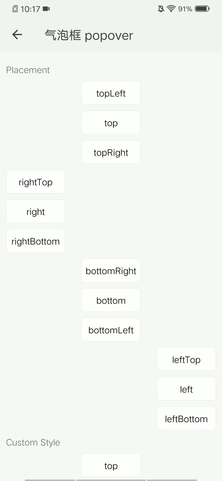
# 使用效果
# 使用方法
在 .ux 文件中引入组件
<import name="my-popover" src="apex-ui/components/popover/index"></import>
1
# 示例
<template>
    <div class="wrap">
        <div class="sample">
            <text class="title">默认</text>
            <div class="item top">
                <my-popover size="{{btn}}" title="title" content='content'>
                    <text class="btn">弹出气泡框</text>
                </my-popover>
            </div>
        </div>
        <div class="sample">
            <text class="title">自定义样式</text>
            <div class="item">
                <my-popover popover-color="#d8bfd8" popover-width="400" popover-height="200" size="{{btn}}" title="title" content="content">
                    <text class="btn">自定义样式</text>
                </my-popover>
            </div>
        </div>
        <div class="sample">
            <text class="title">自定义内容</text>
            <div class="item">
                <my-popover size="{{btn}}">
                    <text class="btn">自定义内容</text>
                    <text slot="title" class="slot-title" onclick="jump('custom title!')">Title</text>
                    <text slot="content" class="slot-content" onclick="jump('custom content!')">content</text>
                </my-popover>
            </div>
        </div>
    </div>
</template>
1
2
3
4
5
6
7
8
9
10
11
12
13
14
15
16
17
18
19
20
21
22
23
24
25
26
27
28
29
30
2
3
4
5
6
7
8
9
10
11
12
13
14
15
16
17
18
19
20
21
22
23
24
25
26
27
28
29
30
.wrap {
  flex-direction: column;
  flex: 1;
  width: 100%;
  padding: 0 20px;
  padding-top: 20px;
  background-color: #f7f7f7;
  .sample {
    flex-direction: column;
    width: 100%;
    .title {
      margin-top:20px;
    }
    .item {
      width: 100%;
      flex-direction: column;
      margin-top: 20px;
      align-content: center;
      align-items: center;
      .btn {
        color: #000000;
        height: 80px;
        width: 200px;
        border: 1px solid #e4e4e4;
        border-radius: 12px;
        text-align: center;
        background-color: #fff;
      }
      .btn:active {
        background-color: #e4e4e4;
      }
    }
    .slot-title{
      color:#ff4500;
      font-size: 30px;
      padding: 20px;
      width: 100%;
    }
    .slot-content{
      padding: 20px;
      width: 100%;
      border-top: 1px solid #e4e4e4;
    }
  }
}
1
2
3
4
5
6
7
8
9
10
11
12
13
14
15
16
17
18
19
20
21
22
23
24
25
26
27
28
29
30
31
32
33
34
35
36
37
38
39
40
41
42
43
44
45
2
3
4
5
6
7
8
9
10
11
12
13
14
15
16
17
18
19
20
21
22
23
24
25
26
27
28
29
30
31
32
33
34
35
36
37
38
39
40
41
42
43
44
45
export default {
    data: {
        btn: [200, 80],
    },
    jump(type) {
        prompt.showToast({
            message: type
        })
    }
}
1
2
3
4
5
6
7
8
9
10
2
3
4
5
6
7
8
9
10
# API
# 组件属性
| 属性 | 类型 | 默认值 | 说明 |
|---|---|---|---|
| popover-width | Number | 200 | 气泡框宽度 |
| popover-height | Number | 160 | 气泡框高度 |
| popover-color | String | '#ffffff' | 气泡框背景色 |
| orientation | String | 'top' | 气泡框方向 |
| title | String | - | 气泡框标题 |
| content | String | - | 气泡框内容 |
| size | Array | - | 调出气泡框的自定义组件的宽高 |
| pix-margin | Number | 20 | 调出气泡框的自定义组件的margin-top |
# slot
| 名称 | 说明 |
|---|---|
| title | 自定义气泡框标题 |
| content | 自定义气泡框内容 |