# 单选框 radio
# 描述
用于让用户在表单选择单个信息项。
# 使用效果
# 使用方法
在.ux文件中引入组件
<import name="my-radio" src="apex-ui/components/radio/index"></import>
1
# 示例
<template>
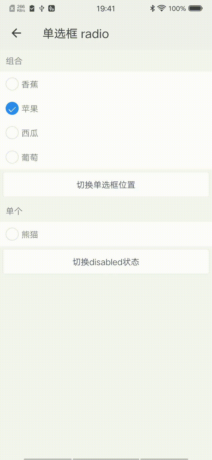
<div class="wrap">
<text class="title">组合</text>
<my-radio-group id="myGroup" current="{{current}}" onchange="handleFruitChange">
<my-radio group="myGroup" for="{{fruit}}" position="{{position}}" value="{{$item.name}}"></my-radio>
</my-radio-group>
<my-button onclick="handleClick" type="ghost">切换单选框位置</my-button>
<text class="title">单个</text>
<my-radio value="{{animal}}" disabled="{{disabled}}" checked="{{checked}}" onchange="handleAnimalChange"></my-radio>
<my-button onclick="handleDisabled" type="ghost">切换disabled状态</my-button>
</div>
</template>
1
2
3
4
5
6
7
8
9
10
11
12
2
3
4
5
6
7
8
9
10
11
12
.wrap {
    flex-direction: column;
    background-color: #f7f7f7;
    .title {
        margin: 20px;
    }
}
1
2
3
4
5
6
7
2
3
4
5
6
7
export default {
    data() {
        return {
            fruit: [{
                id: 1,
                name: '香蕉',
                checked: false
            }, {
                id: 2,
                name: '苹果',
                checked: true
            }, {
                id: 3,
                name: '西瓜',
                checked: false
            }, {
                id: 4,
                name: '葡萄',
                checked: false
            }],
            current: '苹果',
            position: 'left',
            animal: '熊猫',
            checked: false,
            disabled: false,
        }
    },
    handleFruitChange({detail}) {
        this.current = detail.value;
    },
    handleClick() {
        this.position = this.position.indexOf('left') !== -1 ? 'right' : 'left';
    },
    handleDisabled() {
        this.disabled = !this.disabled;
    },
    handleAnimalChange({detail}) {
        this.checked = detail.current;
    },
}
1
2
3
4
5
6
7
8
9
10
11
12
13
14
15
16
17
18
19
20
21
22
23
24
25
26
27
28
29
30
31
32
33
34
35
36
37
38
39
40
2
3
4
5
6
7
8
9
10
11
12
13
14
15
16
17
18
19
20
21
22
23
24
25
26
27
28
29
30
31
32
33
34
35
36
37
38
39
40
# API
# 组件属性
| 属性 | 类型 | 默认值 | 说明 |
|---|---|---|---|
| checked | Boolean | false | 是否处于选中状态 |
| disabled | Boolean | false | 是否处于禁用状态 |
| position | String | left | 选择器所在位置,可选值有left,right |
| shape | String | circle | 选择器形状,可选值有circle,square |
| value | String | - | 展示选项的值 |
| color | String | ''#2d8cf0" | 选中状态的选择器的颜色 |
| group | String | - | 单选框所在组的id值 |
# 组件事件
| 事件名称 | 事件描述 | 返回值 |
|---|---|---|
| change | 值发生变化的事件 | {current:current, value:value} |